Tuesday, April 3, 2012

The Stonebreakers

Gustave Courbet's painting, The Stonebreakers was considered offensive to the bourgeoisie for several reasons. Some of reasons that I can think of are a mix between political and technical things. When looking at Stonebreakers you can see that Courbet used rough paint strokes in the painting, I mostly see these strokes in the background, on the various rocks and objects scattered about. I don't really see the rough brush strokes on the figures though. They seem rather clean and realistic looking. Though I can still see why the bourgeoisie would be upset at the rough brush strokes here and there because of how academic paintings were devoid of noticeable brush strokes.

Another thing to point out would be the size of the figures and how far into the foreground they are. Because of how big the figures are there is very little landscape in the background and Courbet isn't portraying a lot of depth/space in this painting. Though, I personally think that despite the limited background in the painting Courbet was able to portray a good deal of space and depth within the painting. The size of the 2 people in the painting also upset the bourgeoisie because, in the past lower class people were displayed in much smaller sizes, where the landscapes took up most of the paintings.

The subject matter was also offensive to the bourgeoisie because it was of modern, lower class, stonebreakers, who the bourgeoisie thought were not important enough to paint a picture of. The two stonebreakers that you see in the painting are working away by a road. The older man is kneeling down and bending over some rocks with a hammer, while a younger man is trying to carry a very heavy basket of broken stones. Both of these figures are in torn clothing, and you can tell that they are working very hard and struggling with what they are doing.

The figures in Courbet's painting are also not turned to look at the viewer, and even have their faces covered in shadow, which disturbed and upset the bourgeoisie because of the recent unrest of the working class, and because Karl Marx's Communist Manifesto had been published a year earlier. Not being able to see their faces reminded them of the countless working class rising up against them. And not being able to tell what the figures were thinking, was very disturbing and frightening to the higher class bourgeoisie. (It was also considered an untraditional way of portraying people in paintings. There was supposed to be some sort of connection in the painting to the viewer.)

The size of the painting also upset the bourgeoisie because, in the past larger paintings were reserved for historical events with great importance. And since Stonebreakers is showing an untraditional, lowly, subject matter, of the working class, the bourgeoisie considered it offensive towards traditional and historical art.

Friday, March 30, 2012

Avant-Garde

When I've thought about the word “avant-garde” in the past I've always connected it movies or t.v shows with overly artsy people talking about what I saw as really bad modern art. So, I've always associated it as something negative. Our book lists the positive associations of the avant-garde, as forging ahead, breaking down barriers, caring nothing for expectations, being innovative, and challenging conventions. However it also states the its negative associations are, difficulty and incomprehensibility.

I can understand what the avant-garde means to do, by changing art as time goes on by challenging conventions. But at the same time I look at some of these works of art and I don't necessarily think that the avant-garde is always advancing art as a whole.

Just to get this out there, for the most part I can't stand a lot of modern art, and I absolutely cannot stand the topic “what is art?” because I've had that topic drilled into me so much, and the topic never goes anywhere. So, for a good portion of this quarter I'm more than likely not going to be very into/enjoying what we're reading, but I'm still going to give it a chance.

When I was going through our first reading, this is what I thought about the different examples of modern art: Mondrian's Composition with Yellow and White is not a bad painting, even though I'm not a fan of Mondrian he knew how to use color and composition in his art so I respect him; on the other hand I can't stand Marcel Duchamp, the book shows his L.H.O.O.Q painting and I understand that it's supposed to be mocking the Lisa, but my response to that is, “so, you copied a famous painting and drew a mustache on it and wrote that it has a hot ass, so what?” Duchamp is also the one who found a urinal and placed it in a gallery and had people question whether or not it's considered art. which of course there is no answer to; the other artist that I would like to point out is Damien Hirst, and I'm not entirely sure what to think of him between the diamond skull and all of the animals he has suspended in formaldehyde, such as the shark in our book or even the “unicorn.” I mean his work is really interesting, but at the same time I see it more as something that should just be in a science museum rather than as an art exhibit.

Now to move onto Manet's Luncheon on the Grass and how I think it challenges the viewer. Some of the things that Manet did that might have been considered avant-garde were, his use of brush strokes. Up until then paintings, from the Academy, had no traces of brush strokes in them. In Manet's painting he use quick brush strokes with thick paint. Because of this a lot of objects in the painting look like blobs and the painting looks more like a study rather than a completed work of art.

Another thing that Manet did was he depicted a nude of a modern prostitute, instead of depicting a classical nude, with modernly clothed men. One interesting thing about the prostitute is how she is staring out at the viewer as if you're apart of the picnic as well.

The other avent-garde challenge to conventional art that Manet put into the painting is the woman bathing in the background. Even though she's far into the background she is the same size as all of the other figures in the painting, when she should be a lot smaller. This makes the foreground/middle ground/background a bit confusing and a lot of the painting seems very flat.

Wednesday, March 7, 2012

What I liked the most?


During this term the type of art that I particularly enjoyed studying was, art in the 15th century by Jan van Eyck.

Considering that I just began to study oil paints this term I have to say that the most inspirational person to read about (and see the works of) is van Eyck. Just the detail image of Giovanni Arnolfini and His Wife on page 575 is enough to make me want to head over to the studio and paint. The beads hanging on the wall in particular are my favorite part of the painting. The way that van Eyck was able to show light shinning through the beads and into their shadows amazes me. Another aspect that I like about it is the weight that I feel from the beads as they hang from the nail in the wall. You can see that the thin rope is tight with their weight, but not so much that it is straining the rope or the nail.

Right after reading this chapter I actually had to paint clear beads in a still life, and even though they're no where near as incredible as van Eyck's I'm still proud of myself for being able to show light passing through them, and the little bar in the middle for the line to go through.

Another thing that I just now noticed in the detailed image is the window's reflection in the mirror. It shows the outside world a bit more than the actual window in the painting. I can't exactly tell what I see in the window's reflection, but it looks almost like a row of sunflowers. That mirror really does reflect everything from a different perspective. It's nice to be able to see the backside of the fruit, the rest of the furniture, and even all of the details on the ceiling.

(The only thing that I don't see reflected in the mirror is the dog, why wouldn't the dog be in the reflection? It's standing between the couple so it should be there.)

The other thing that is probably the most striking to me about this painting is the size of it. The whole double portrait is only 33x22 ½ inches. That strikes me so much because it's only a little bit bigger than the canvases that painting students have to use in their classes. It's insane to think that he was able to get so much detail into a canvas that's that small. And because of the amount of detail in the painting every time I look at it I see something new. Just now I noticed the stained glass design above the window, but oddly enough that too is not reflected in the mirror.

Wednesday, February 29, 2012

Mill Paintings

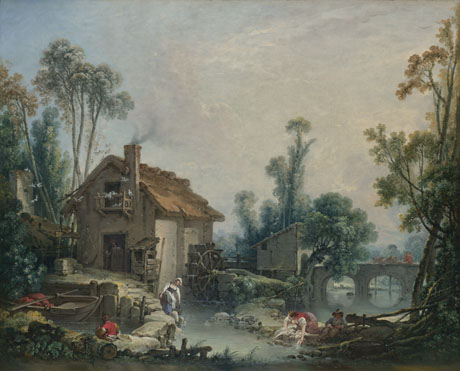
For this weeks blog I have decided to write about several works of art by Francois Boucher. I wasn't able to find as much information as I had hoped to on these paintings, but there were no full text articles online about Boucher's landscapes.

Here are the paintings:

1. The Mill, 1751


2. Landscape with Watermill and Temple, 1743. Oil on canvas


3. Landscape with a Watermill, 1755. Oil on canvas, 57.2 x 73 cm.


And on Artstor when searching for Francois Boucher Watermill. I also found information on Landscape with a watermill here http://www.nationalgallery.org.uk/paintings/francois-boucher-landscape-with-a-watermill

That last link was able to provide me with interesting information on why Boucher was so interested in these soft, idyllic landscapes in rural areas. All three of these paintings are of Boucher romanticizing about the “rural way of life” and rural landscapes in general. Which makes sense because Bocher was considered to be a Parisian Rococo painter, like Watteau.

Within each of these paintings the viewer can see how Boucher has created an all around beautiful and idyllic landscape with people living in/working in it. However the people are not the main focus of any of these paintings. Sure they are there and doing their daily work or relaxing, but the scenery and the mills take up most of the space in the paintings and dwarf the people inhabiting them.

Out of the three paintings I think that Landscape with Watermill and Temple accomplishes this romantic and idyllic feeling the best. The figures in this painting are smaller than in any of the others. And you get an immense feeling of deep space with the forest and sky behind the mill. The part that I think romanticizes it the most though is the Roman looking temple in the forest.

One thing that I find interesting about the other two mill paintings is how similar they both look to one another. I feel as if Boucher has a very set ideal for what a rural mill would look like, and he sticks to that throughout his paintings. Both of these paintings look so similar to me I feel as if the mills would be found near each other on the same stream.

Comparing all three of them though I can see a rather major shift. Landscape with Watermill and Temple was painting in 1743 and has very dramatic lighting and a sharpness to it, that is just not seen in the other two mill paintings that were painted 12 years later.

Wednesday, February 22, 2012

Bernini V.S Michelangelo

I've been waiting forever to write on a subject like this, and I promise that I'm going to keep it as far away from “Bernini is better than Michelangelo because...” as possible..... even though he is.

During the Baroque period in the 17th century they incorporated ideals like naturalism, and a very small amount of idealism, into their work. While they also rejected humanism, because it wasn't the subject for art at the time due to the counter reformation.

In Bernini's “David” you can see that David is portrayed as a more naturalistic person, and not entirely idealized like Michelangelo's “David.” With Bernini you can see a lot of muscles on David's body, however you don't see all of them, and David is also much more mature looking. Unlike Michelangelo's where you see every muscle on young David's body in perfect definition.

Even though Bernini's David isn't idealized, it's still a depiction of a famous Classical character and it makes up for not being idealized with the amount of drama and energy that can be seen in it. Michelangelo's David is very static standing there in contrapposto, and just being the ideal person who accomplished something great (or is about to.) While with Bernini's David it's a lot harder to tell what David is doing, because the statue looks different from every angle.

From one angle it looks like he just got his sling into position to throw it, but from other angles it looks like he is building up the energy and power in his body to launch it at Goliath. From one angle in particular it looks like the exact second that he is going to throw it with all of his might. This illusionism was valued in Baroque art, and for David it really helps trick the viewer into to thinking that the statue is going to start moving.

Both of these statues where made of the same material and depict the same story, but because of Baroque art Bernini wanted to show a Classical David in action, while also using illusionism to involve the viewer with the story to make it seem as if part of it was happening right in front of them. To that end I believe that Baroque art added ideals that Renaissance art needed, and I'm glad that it was able to borrow from the Renaissance and improve upon it to make the great works of art that we can see today.

(p.s. Bernini made stone look like squishy skin!) http://maitaly.files.wordpress.com/2011/03/proserpina5.jpg

Wednesday, February 8, 2012

Albrect Dürer watercolor

In order to show Albrect Dürer's relationship with early northern European traditions, and the Italianate features in his artwork I have chosen two works of art.

Wing of a Roller, 1512, watercolor and gouache on vellum,


Cupid the Honey Thief, 1514, Pen and ink and watercolor on paper.


I chose Wing of a Roller because the amount of fine details in it reminded me of earlier works by Jan van Eyck. In Dürer's watercolor study of this bird's wing he brings out an enormous amount of realism and naturalism in the painting. When looking at the bird's wing you can see where every feather starts and stops, and how it overlaps the next one beneath it. By looking at it you can also feel the textures associated with each of the feathers. From the soft fuzzy ones where the wing used to meet the body, to the soft, fragile, and small ones in the middle of the wing, and to the stiffer long ones that make up the lower half of the wing. Though my favorite detail for the wing has to be how he took note of how some of the feathers are shiny and have light roll across them, while how others are just muted and softer in the light.

When looking at this painting I just want to stick my hand out and mess up the feathers, because it feels as if there should be more underneath of what we are seeing. His use of color is also beautiful, and when looking at a real picture of a Roller you can definitely see what he saw while creating this work of art.

While the other work I chose, Cupid the Honey Thief, reminded me of an Italianate style. The woman in the painting is in a contrapposto pose, with almost all of her weight going onto her right foot. Her body is very natural, and though she is not entirely nude, you can see almost all of the curves on her body, and the painting does seem to be celebrating the nude figure. There are also a lot of fine details throughout her whole body. And I've just now realized that this figure looks a lot like Dürer's Eve, from his Adam and Eve engraving. They both have the same forehead, nose, hair, and body shape.

Her arm is also foreshortened, a long with Cupids leg as he's trying to get away from the bees swarming him. It almost looks as if she is scolding him for stealing the honey. One thing that also struck me about that ugly cupid is how he has wings on his back. It's a strange mix considering all of the other humanism/naturalist qualities in the painting, and I also find it kind of strange that his wings are one of the only areas of color in the painting.

In all honesty though, the main reason why I chose these works is because I saw it as an opportunity to be able to write about watercolor in this class. I wish that there were more opportunities for it though, because of how beautiful some of these paintings can be. I wanted to write about more Dürer watercolors that I found, that showed some beautiful atmospheric perspective, but I don't have the time to write about them all day. So to whoever reads this I'd like for you to check out the 2nd link that Professor Bowen posted and look for the two Dürer watercolor galleries.

Wednesday, February 1, 2012

Mannerism........¿¿¿

Abraham Janssens, The Origin of the Cornucopia can fit within the realm of Mannerism for a few reasons. The first being how the figures within the painting are twisted and positioned in ways that make them seem out of balance. For a lot of the figures I feel as if they are either going to fall forward onto their faces, or fall sideways, as if they are drunken and unstable. The second reason being how out of proportion each of the figures are. This is especially noticeable in the figure on the right side of the foreground, her thigh/leg is utterly massive, however most of the figures in the painting have out of proportion limbs.

The Origin of the Cornucopia reminds me a lot of the Allegory with Venus and Cupid on page 663. In both of the paintings all of the figures seem rather pudgy with well toned muscles. It's kind of a strange mix that seems to come from this Mannerist style. The more I look around Cornucopia the stranger the things I see. Especially in that one woman in the right foreground. I've just now realized how big her shoulder is, it's just as big, if not bigger than her entire head. Both of these paintings are also very busy, with each figure doing something, such as pointing one way but looking another. It's all rather confusing and I'm not sure what the focus of the paintings should be.

Vincent Sellaer, Leda and the Swan and Her Children reminds me a lot of Pontormo’s Entombment on page 661. The lighting, and the way the figures are painted, are quite different in each painting. However they are similar in how the figures seem to be floating in space and not resting on everything. They seem stacked and you can't tell what their bodies are resting on.

In Leda and the Swan what I really want to know is what she is leaning her body on. You can see that under the cloth that he leg is laying on something, and that her right arm is resting on the swans neck, but she feels horribly off balance and as a painter it bothers me to be honest...

The weightlessness, and the lack of balance that each figure has ties the painting to Mannerism. There is some elongation with the figures as well, but it isn't quite as apparent. I can really only see it in the woman's left arm, and with the standing child in the background. I feel as if the child should be a lot shorter then that, but then I'm also not sure where his feet are supposed to be..

However I will say that I think that the swan was a good choice for this mannerist painting, because they already have elongated necks. (Hah.. bad joke)